LOGO REFRESH
During the process of re-branding, we refreshed the logo. The font remained the same, but was updated by removing dull gradients and a drop shadow. The logo now features a mark that resembles a tire moving forward. This speaks to the constant motion of the company, but the the three colors are also a nod to the three main divisions of the company: tours, charters, and experiences. The teal and green were existing brand colors. We added the blue for a pop of energy and modern color.
LOGO BEFORE
TOUR BOOK TEMPLATE
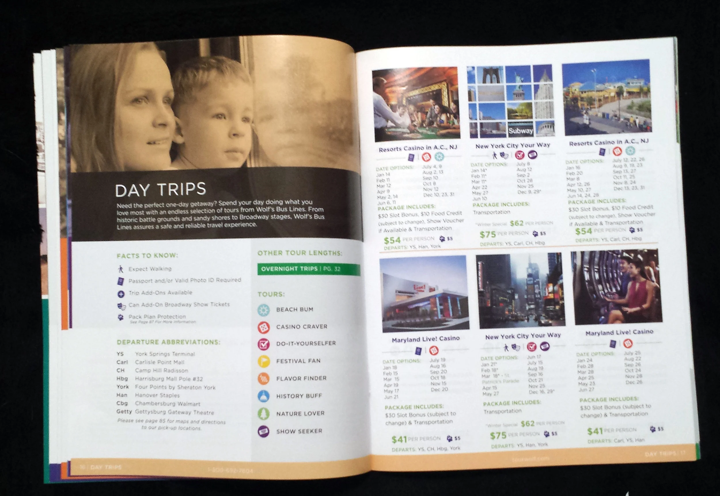
Each year, Wolf's puts out a catalog of all of its trips. Previously, this book was built from scratch each year. While an inefficient use of the company's time, the designs were also outdated and confusing.
With the rebrand, we decided to focus on the customers and experiences. We took a unique approach with organizing the tour catalog by categorising the trips by personas which are represented with icons. We developed eight different personas from Casino Cravers to Beach Bums then divided the trips by day and overnight The outcome is a modern design that stands out from its competition.
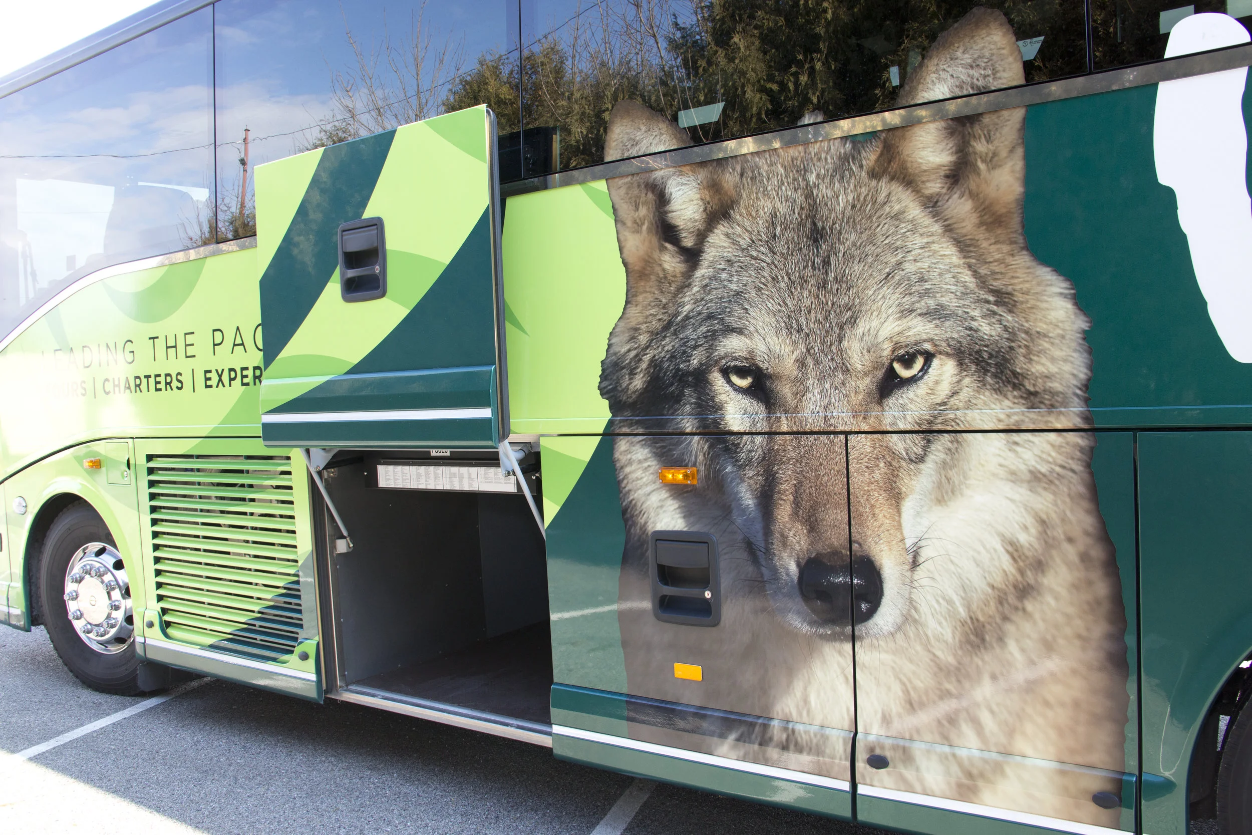
![20170321_190158.jpg](https://images.squarespace-cdn.com/content/v1/56c293588a65e284f1d93678/1490141382699-7EIOL2BBMO3F5M2WQF1P/20170321_190158.jpg)
![20170321_190210.jpg](https://images.squarespace-cdn.com/content/v1/56c293588a65e284f1d93678/1490141386012-22FD9L54M4GV9NX68IVN/20170321_190210.jpg)
![20170321_190708.jpg](https://images.squarespace-cdn.com/content/v1/56c293588a65e284f1d93678/1490141419364-JUGBUF33DE1OJ7B6L4EN/20170321_190708.jpg)
![20170321_190320.jpg](https://images.squarespace-cdn.com/content/v1/56c293588a65e284f1d93678/1490141396465-MO5HYCGEH29OGJMJ0S16/20170321_190320.jpg)
![20170321_190420.jpg](https://images.squarespace-cdn.com/content/v1/56c293588a65e284f1d93678/1490141406047-0DKRYKZD6F54H13Y1DJP/20170321_190420.jpg)
![20170321_190522.jpg](https://images.squarespace-cdn.com/content/v1/56c293588a65e284f1d93678/1490141407332-GUSXVGB0X7A4R8MKPOW3/20170321_190522.jpg)
![20170321_190609.jpg](https://images.squarespace-cdn.com/content/v1/56c293588a65e284f1d93678/1490141422608-F2RZL2DTYXANJ6RZSXRT/20170321_190609.jpg)
ANNIVERSARY BUS
The anniversary bus was the first element of the brand that the public and customers were exposed to. We modernized the color palette by bring the bright green to the forefront and used the logo to create an energetic swirling pattern.
An issue that the brand struggled with before was that each bus had a different type of wolf: various photographs, vectors, and cartoons. With the refresh we introduced one Wolf image that is used across all platforms.
![Wolf1-31-17_0397.jpg](https://images.squarespace-cdn.com/content/v1/56c293588a65e284f1d93678/1490057195032-1PJOVHZUF0VIDOOTKWT1/Wolf1-31-17_0397.jpg)
![wolf1-31-17_0114.jpg](https://images.squarespace-cdn.com/content/v1/56c293588a65e284f1d93678/1490057368413-UQWO0GQORCLIBOGQ9QCU/wolf1-31-17_0114.jpg)
![WolfBus2-6-17_0366.jpg](https://images.squarespace-cdn.com/content/v1/56c293588a65e284f1d93678/1490057208963-30BN28MCB6DDXGEFVOE0/WolfBus2-6-17_0366.jpg)
![Wolf1-31-17_0296.jpg](https://images.squarespace-cdn.com/content/v1/56c293588a65e284f1d93678/1490057352720-A1QGALQN5T5W4BZHY7HR/Wolf1-31-17_0296.jpg)
![WolfChri16_0031.jpg](https://images.squarespace-cdn.com/content/v1/56c293588a65e284f1d93678/1490057271782-I3U4NBHEMIFO2CXMUU7D/WolfChri16_0031.jpg)
![WolfChri16_0040.jpg](https://images.squarespace-cdn.com/content/v1/56c293588a65e284f1d93678/1490057270867-4KPGERZ4F780OWWA51MI/WolfChri16_0040.jpg)
WEBSITE
Prior to the re-brand, Wolf's Bus Lines had a total of three different websites which were about as easy to navigate as a maze. The redesign merged the sites into one and simplified the navigation to provide a better user experience.
![screencapture-wolfsbus-2018-05-29-19_02_52.png](https://images.squarespace-cdn.com/content/v1/56c293588a65e284f1d93678/1527635293774-WAZYZ2VCM0D4MTT178NC/screencapture-wolfsbus-2018-05-29-19_02_52.png)
![screencapture-wolfsbus-about-2018-05-29-19_04_26.png](https://images.squarespace-cdn.com/content/v1/56c293588a65e284f1d93678/1527635289308-A1MGWEWEODG3EQIINA2O/screencapture-wolfsbus-about-2018-05-29-19_04_26.png)
![screencapture-wolfsbus-charters-2018-05-29-19_06_12.png](https://images.squarespace-cdn.com/content/v1/56c293588a65e284f1d93678/1527635297636-M0JEA7HZNTAQ2014GV0J/screencapture-wolfsbus-charters-2018-05-29-19_06_12.png)
![screencapture-wolfsbus-charters-military-charters-2018-05-29-19_06_46.png](https://images.squarespace-cdn.com/content/v1/56c293588a65e284f1d93678/1527635308893-RBA6QP4DXVS6KB38CLPE/screencapture-wolfsbus-charters-military-charters-2018-05-29-19_06_46.png)
![screencapture-wolfsbus-the-wolfs-2018-05-29-19_05_15.png](https://images.squarespace-cdn.com/content/v1/56c293588a65e284f1d93678/1527635316333-K2JTBTAX1UB6B1V66Y5I/screencapture-wolfsbus-the-wolfs-2018-05-29-19_05_15.png)
T-SHIRT DESIGNS
The client wanted a special shirt to celebrate their 70th year. I designed three different t-shirt options. I based my first designs off of the following concepts: the classic road trip question, "Are we there yet?", an ode to their cross-generation success "Pack Proud 70 Years," and lastly, a band tour inspired shirt that features the biggest trips of the year on the back like concert tour dates. The client couldn't choose just one design - so they chose them all!
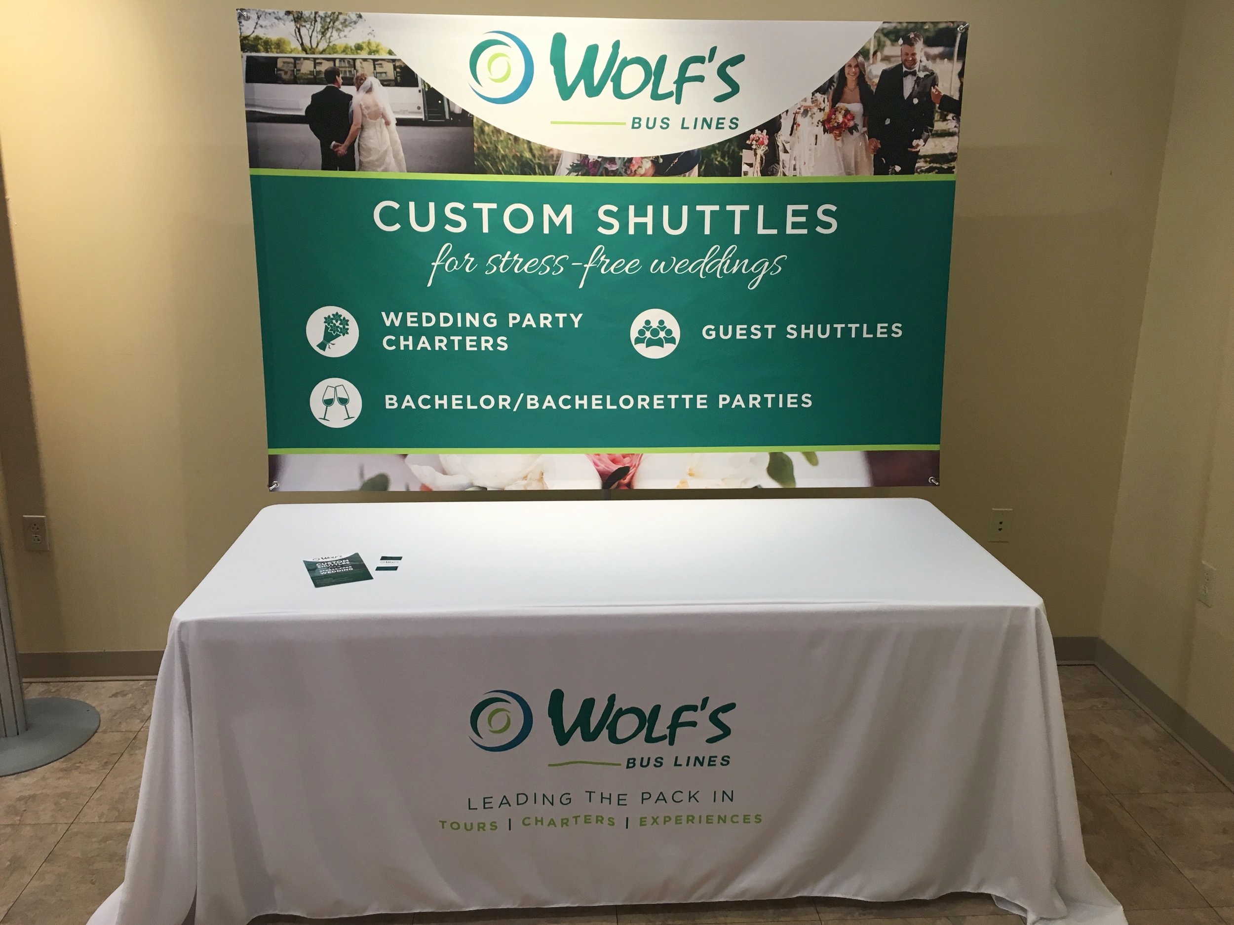
WEDDING EXPO SETUP
As a charter service, Wolf's seeks business from weddings. I was challenged with adding a bridal feel to Wolf's new branding. This project consisted of creating a compass banner, table drape, rack card, and giveaway item. The giveaway was a bag of branded M&M's wrapped up in delicate white drawstring bags complete with a tag that read "Let us be your carriage." The client was so excited about the outcome of this project that they are seeking to do more wedding expos as well as purchasing more banners to market other sectors of their business.
![WBL1600_TableDrapeCompassUnit_FinalPicture.jpg](https://images.squarespace-cdn.com/content/v1/56c293588a65e284f1d93678/1490059028436-LP9X0334P7EHYA2WRP1U/WBL1600_TableDrapeCompassUnit_FinalPicture.jpg)
![20170112_131828.jpg](https://images.squarespace-cdn.com/content/v1/56c293588a65e284f1d93678/1490058978424-CYXD3886H9M1BU16UY6N/20170112_131828.jpg)
![20170112_131712.jpg](https://images.squarespace-cdn.com/content/v1/56c293588a65e284f1d93678/1490058916415-XYE0XQC2JM2QBXCOA9SQ/20170112_131712.jpg)
![20170112_132207.jpg](https://images.squarespace-cdn.com/content/v1/56c293588a65e284f1d93678/1490058580002-77T3RLJ18GTEMM0J3TF9/20170112_132207.jpg)
CHARTER AD
This design is a full page ad for local business catalog. The ad was required to be black and white. This worked toward my advantage as for the charter side of Wolf's uses black to communicate a professional, sleek presence while the tour side is lighter and more fun.
WOLF'S BUS LINES | RE-BRAND
Wolf's Bus Lines is a third generation family-owned bus line located in York Springs, Pennsylvania. Wolf's offers tour and charter services. For their 70th anniversary, Wolf's decided to rebrand.
This in-depth project has taken months of hard work and resulted in many different deliverables.